Design, products & technical work
Selected work
A mix of identity, product, and technology work, spanning brand design, software, and applied AI.
#Brand & Identity
Five logo and identity projects, each with the story behind the mark: who the client was, the idea driving the design, and where it ended up living.
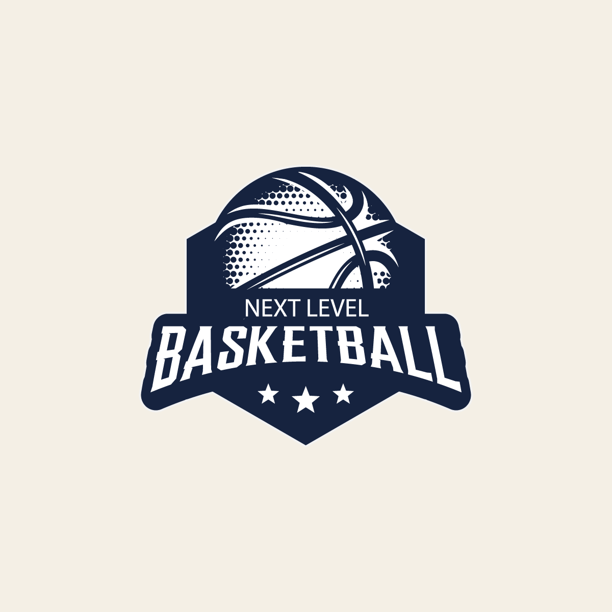
Next Level Basketball
A youth basketball club needed a mark that read as competitive at a glance — on a jersey across a gym, on a banner, on a phone — not just "a basketball inside a shape."
The crest shape borrows from varsity athletics tradition to read as established. The basketball is rendered in a dotted halftone rather than flat clip art, giving it texture and motion, and the three-star underline plus stacked wordmark keep the hierarchy legible even shrunk down to a sleeve patch.
Delivered as the primary crest, used on jerseys, court signage, and social/app icons.
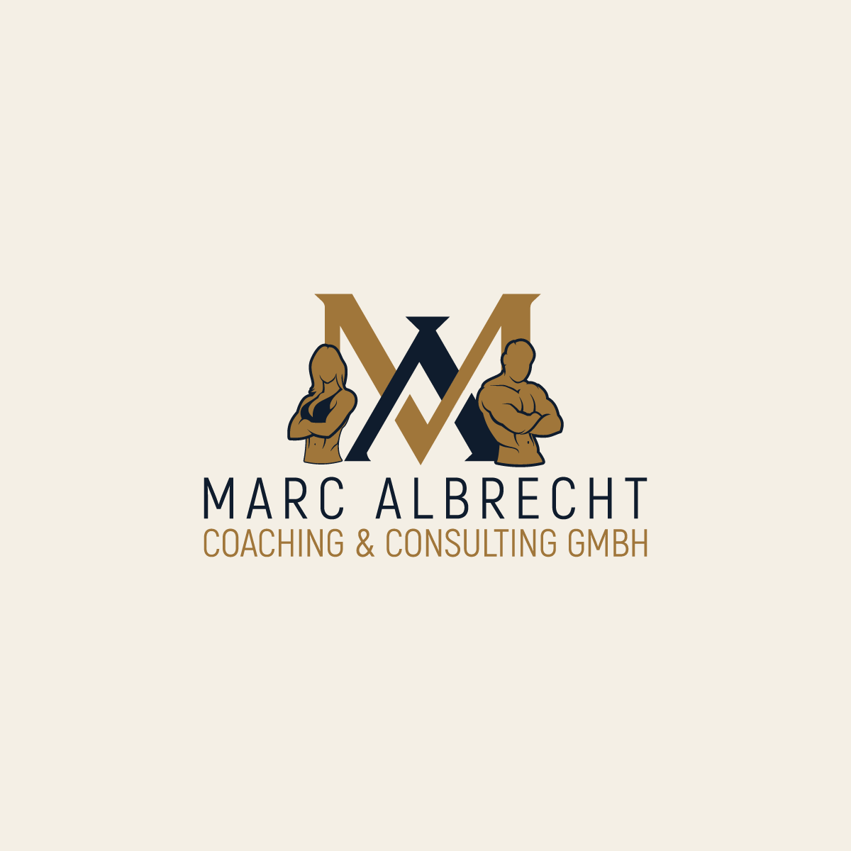
Marc Albrecht Coaching & Consulting GmbH
A coaching and consulting practice needed an identity that read as consultancy-grade rather than gym-flyer casual, serving both corporate and individual clients.
The interlocking monogram doubles as the male and female figures flanking it, so the mark itself says "coaching for anyone" without a tagline. Setting the whole lockup in a single warm gold keeps it closer to a consulting brand than a fitness brand.
Delivered as a full identity kit anchored by the monogram, with a two-line wordmark for business cards, signage, and print.
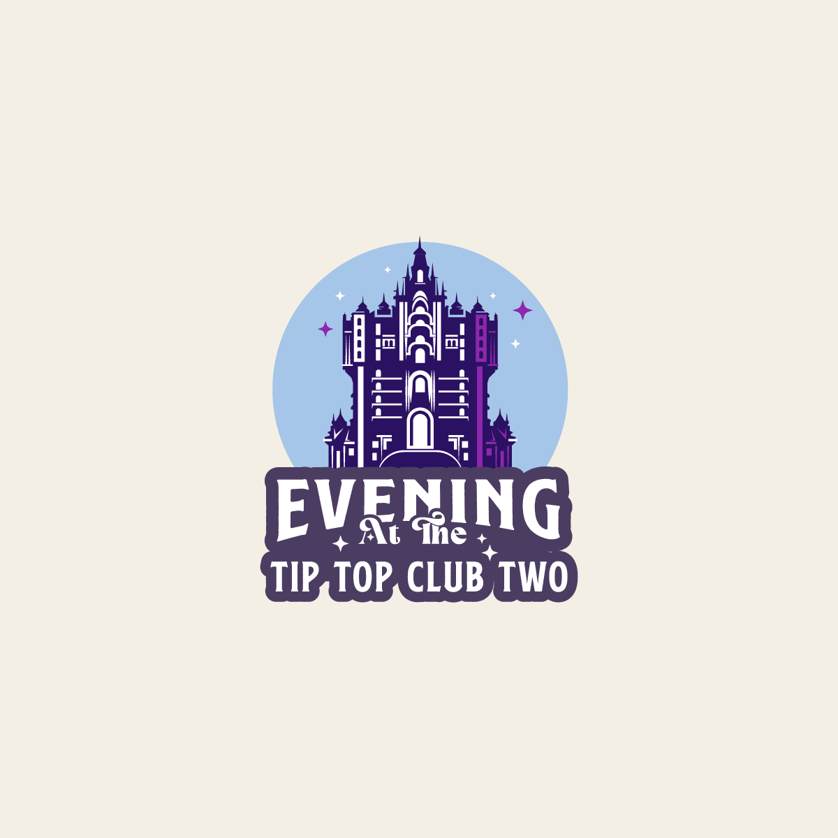
Evening at the Tip Top Club Two
WDW Radio needed event branding for "Evening at the Tip Top Club Two" that felt vintage in spirit and could hold up printed small, on a badge or pin, not just as a webpage banner.
The illustrated tower stands in as the club's landmark, framed inside a period circular badge with a script-and-serif type mix — the kind of lockup that already reads like a decades-old hotel key fob rather than something drawn for a livestream.
Delivered as a circular badge mark, used for event pins and promotional artwork.
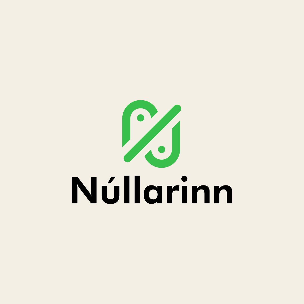
Núllarinn
Núllarinn needed a mark trustworthy enough for the 0%-alcohol category, where branding usually defaults to either clinical or juvenile.
The abstract mark reads as a stylized zero split by a diagonal — a quiet nod to "0%" without spelling it out. A single green keeps it closer to premium packaged goods than a soft-drink label, paired with a plain-set wordmark for legibility at small sizes.
Delivered as a standalone mark plus wordmark lockup, used across the storefront and packaging touchpoints.
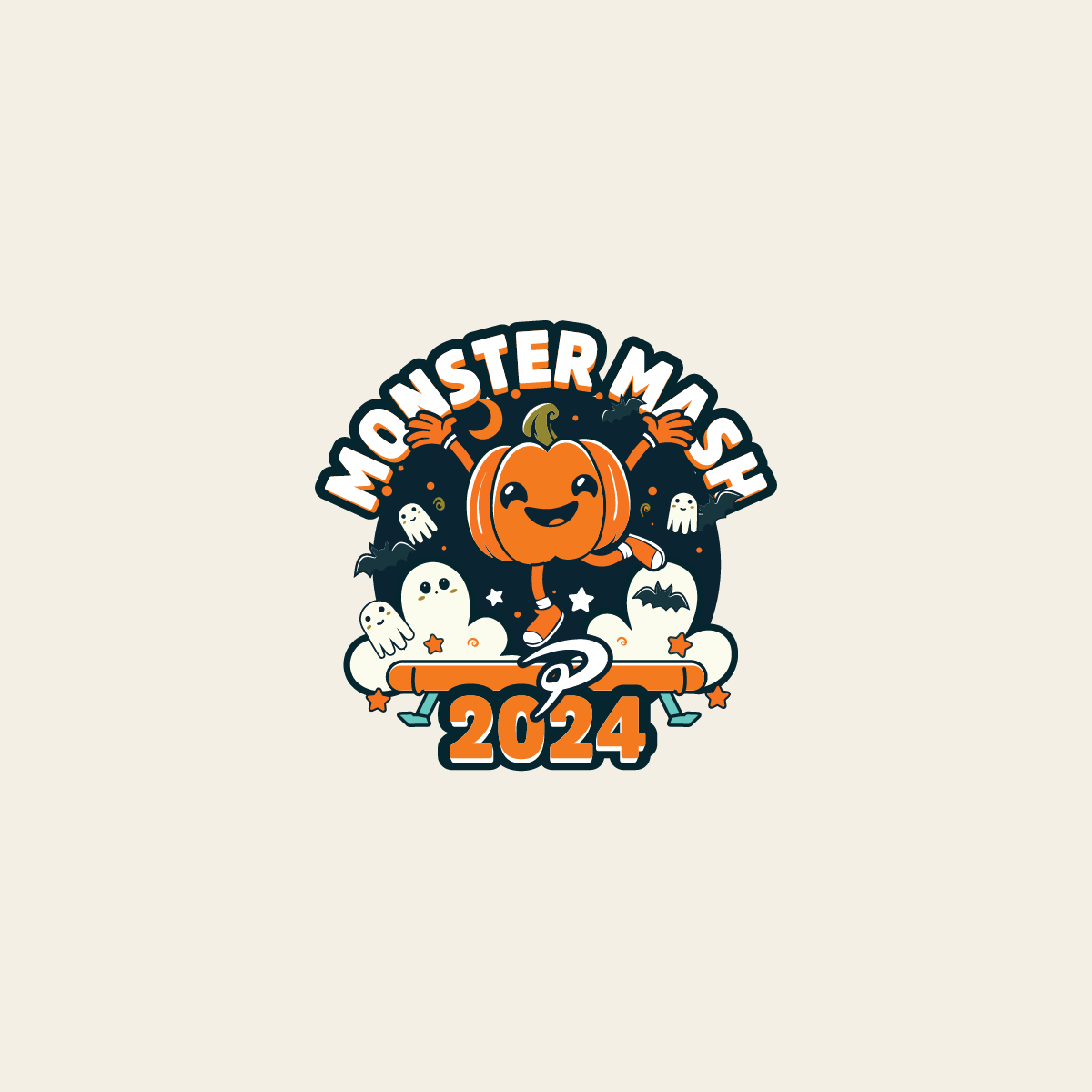
Monster Mash 2024
Monster Mash 2024 needed artwork that could stand alone as festive merch — a T-shirt or badge — not just a poster graphic.
A single friendly pumpkin mascot, rather than a spookier route, keeps the mark approachable for a broad event audience. The arced lettering and supporting ghost and bat details add texture while staying readable at a glance, all wrapped into one circular badge for versatility.
Delivered as an event badge, used across 2024 merch and promotional artwork.
#Featured engagements
Studio D — 500+ identity projects
An independent logo and brand identity practice developed through long-term client work on Fiverr since 2014.
Oraxs Dental Platform
Development leadership for a multi-tenant dental operations platform connecting clinical workflows, scheduling, billing, and patient experiences.
Ceylon Vault
Building a trustworthy gemstone brand around Sri Lankan sourcing, certification, product presentation, logistics, and international online sales.
#Labs & ventures
Local AI & RAG Lab
A hands-on environment for local language models, retrieval systems, coding assistants, and privacy-conscious automation.
Legacy Data Migration Tooling
Tools and workflows for moving complex legacy healthcare data into modern cloud software with validation and traceability.
AI-assisted communication research
Exploring local, approval-first workflows that organise messages and draft responses without sending on the user's behalf.